
SplitSmart - AI Receipt Scanner
Project Overview
Managing group payments, like splitting grocery or restaurant bills, can be confusing and time-consuming. One person usually pays the full amount, leaving the challenge of dividing costs fairly. This often leads to mistakes, delays, and awkward follow-ups, making the process more complicated than it should be.
PROBLEM STATEMENT
Individuals who make purchases for others need a tool to track their spending.
SOLUTION
Design an app to scan receipts and track spending, set to launch by 2025.
ROLES
Product Designer
RESPONSIBILITIES
Wireframes, information architecture, user flows, design communication, brand
FREELANCE DURATION
September 2024 - Present
Process
1. Design System
2. Information Architecture
3. User Flow
4. Wireframe
5. Team Feedback
6. Iterate Design
How it started…
REQUIREMENTS
1. Branding for “SplitSmart”
Color
Logo
Typography
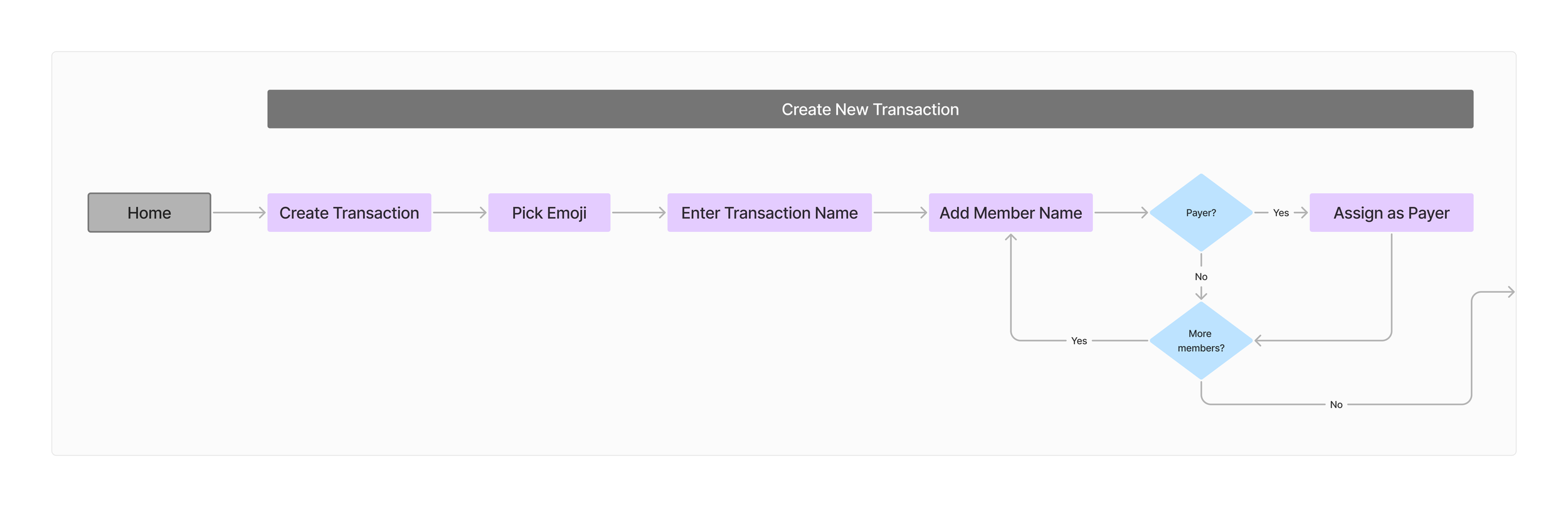
2. Design main user flow
3. Design while expanding this vision
Design System
Information Architecture
User Flow
Iterative Design
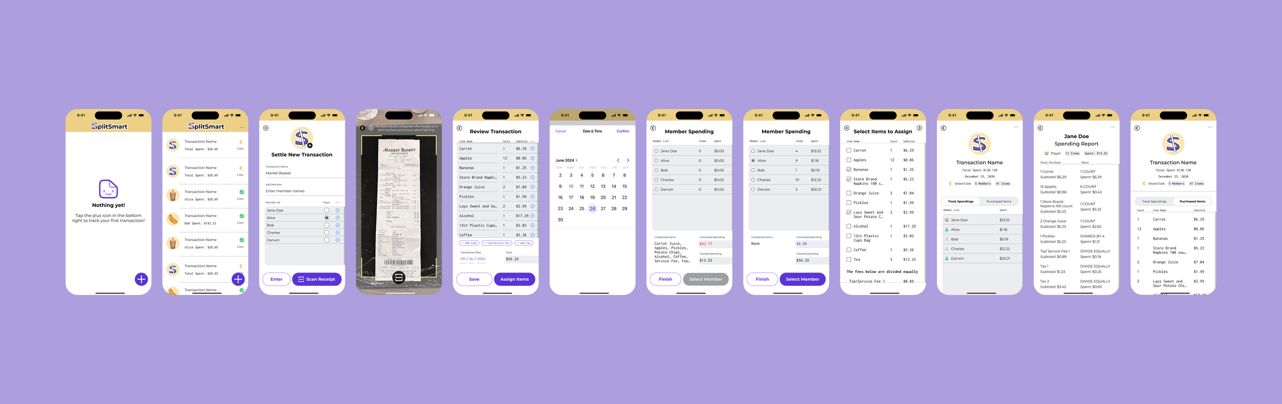
Settle Transaction
Revising “Debt Relationship”
Before
“Debt Relationship” assumes the user only cares about what they owe.
By scanning a receipt, users actually want to track how much everyone owes and “Debt Relationship” does not identify the payer.
Iteration 1.1
Shifts the concept from “owe” to “spent,” emphasizing overall transaction rather than individual transactions.
Adds UI to select “Who Paid?” out of the members added.
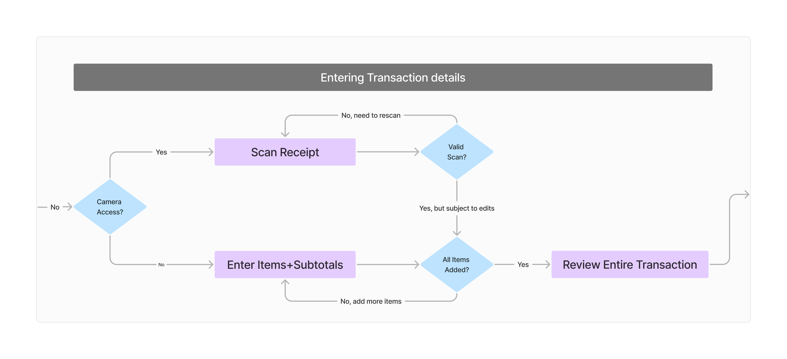
Entering Transaction Details
Iteration 1.0
Each member has their own list of items they've spent on, making it challenging for users to share portions of an item.
Users limited to a single tip and tax input.
Iteration 1.1
Single comprehensive list for all items.
Users add items, tip, and tax in a consistent manner without limit.
Iteration 1.2
Improved use of color, layout, and capsule-shaped buttons.
Tip and tax inputs are distinctly added.
Due to the complex nature between items, tip, and tax, the team ultimately decided to equally distribute tip and tax for the MVP.
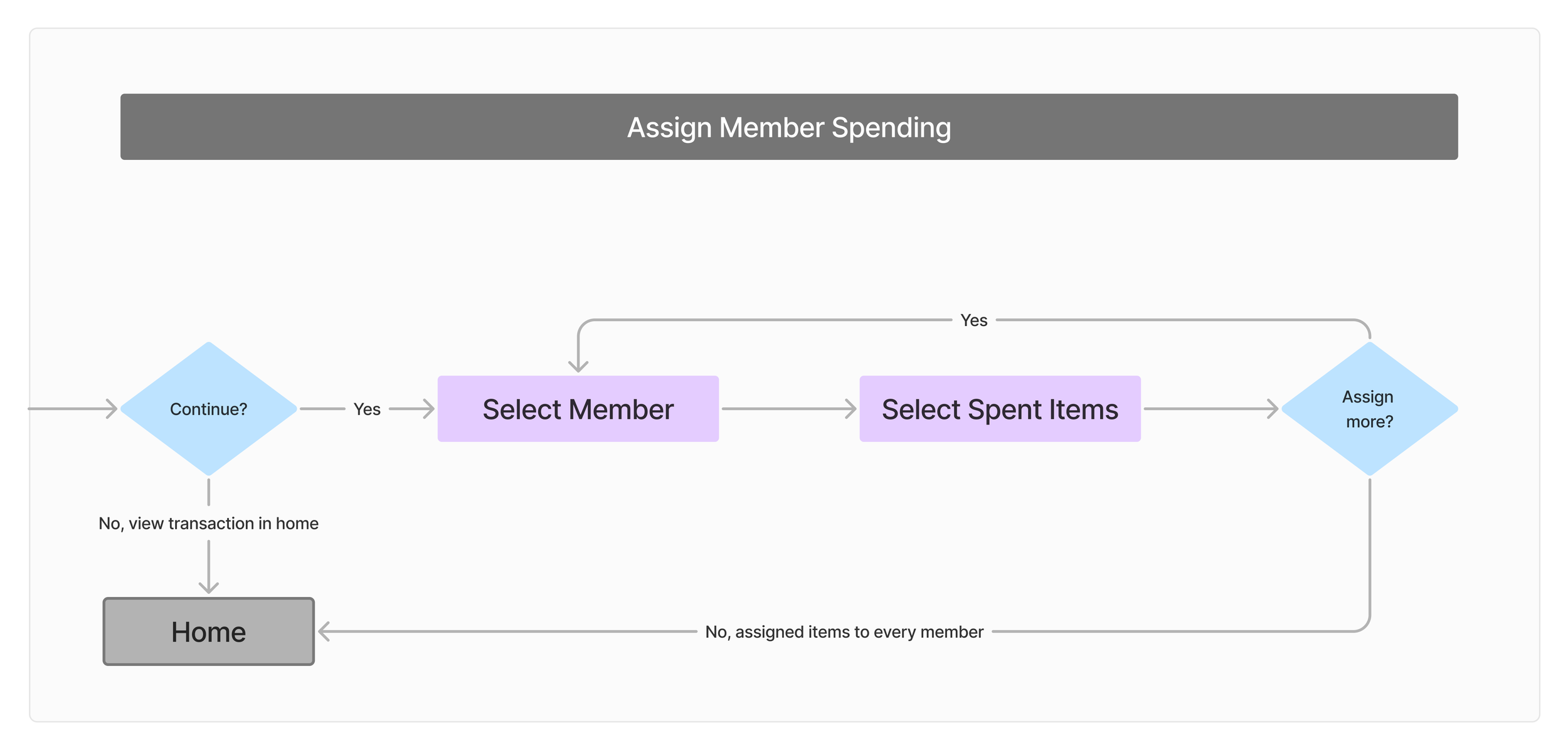
Assign Member Spending
Iteration 1.1
Team was not a fan of the checkered layout.
Default screen state always selected the first member.
Iteration 1.2
Updated layout based on feedback.
Default screen state disables “Select Member” button, requiring users to make an intentional selection.


